A customer-facing Construction Operations Monitor gains a new feature — built by a different team, and expected to look as though it had always been there. A planner sets one priority, cost, time or distance, and the scheduler returns scenarios to weigh against each other.
RoleUX design, design system, UI
TypeEnterprise web application
ToolsFigma · Adobe XD · Office
Year2020–21
A feature built by one arm of the business, landing inside a product built by another.
MakeTrue sells a web application that lets customers run large-scale construction projects — the Construction Operations Monitor, or CoM. A separate team had built an equipment-scheduling application, and it needed to live inside CoM as though it had always been there.
The scheduler lets planners manage construction equipment across sites and see simulated scenarios for a given set of sites and machines, by declaring which of three things matters most on this job: cost, distance or time.
The problem
Heavy equipment is expensive to own and more expensive to move. A concrete pump sitting idle at one site while another crew waits for it is a cost that never appears on a single line item — it shows up as delay, as fuel, as a hire day nobody planned for.
Planners were making these calls from memory and spreadsheets. The brief was to give them a way to ask the question properly, and to see what each answer costs.
As a contractor or developer, I want to use the CoM's Equipment Scheduler to schedule the usage of the equipment I own, so that I can save the time, cost and distance it would otherwise take to move machines between sites, depending on what the project needs.
Adopting a house style that was never written down
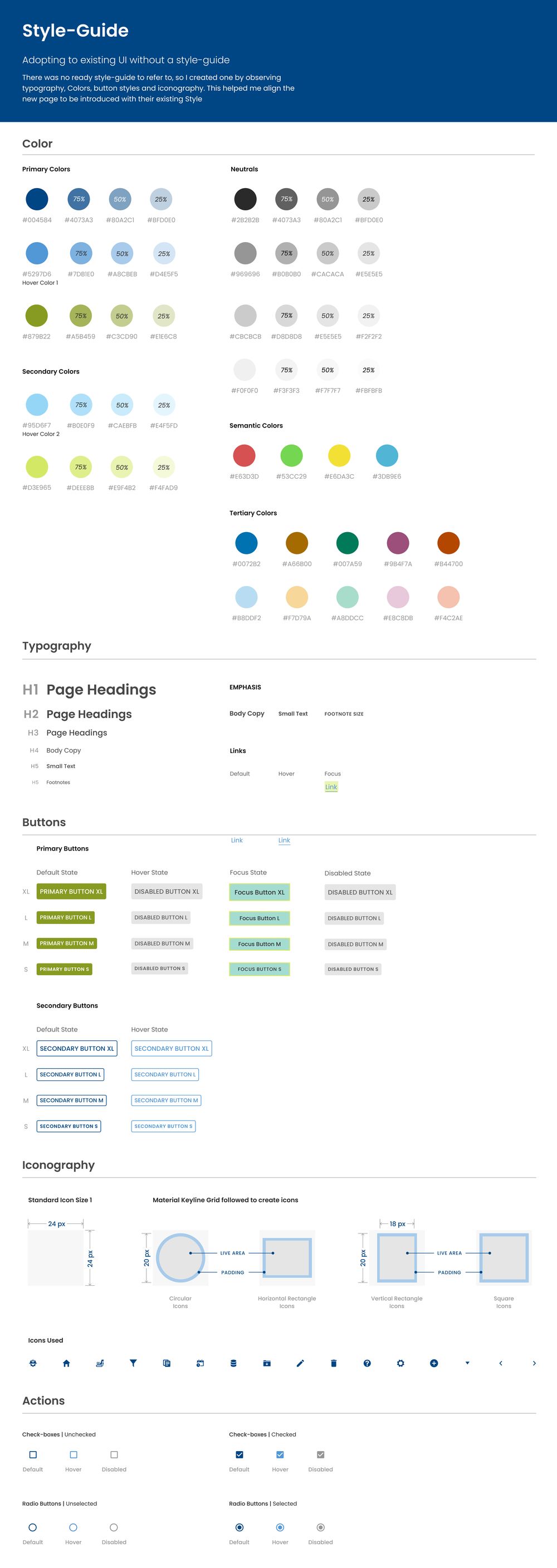
There was no style guide to work from. The product existed, it was consistent enough to feel designed, but nothing had been documented — so the first job was to read the interface back into a system: typography, colour, button styles, iconography.
I built that guide by observation. It is what let a brand-new page sit inside the existing product without announcing itself as an outsider.
Blues and greens are awkward neighbours in an interface, because both are already doing semantic work — a green that means "go" cannot also be a brand green without confusing someone. Keeping enough distance between those hues was the constraint the palette had to satisfy before anything else.
Turning the observations into a design system
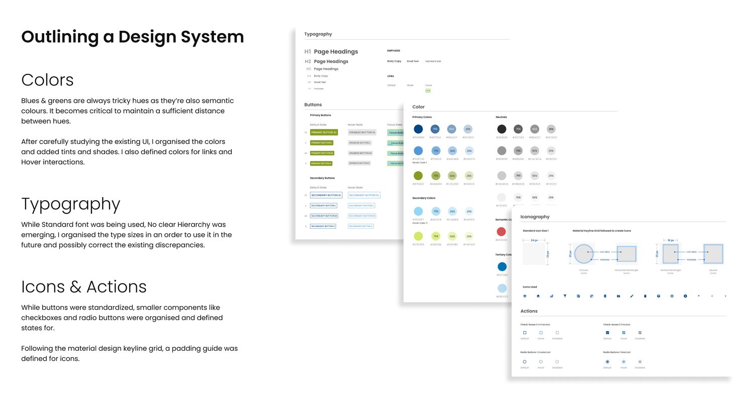
With the existing UI documented, the next step was to organise it into something extensible — tints and shades derived properly, a type scale with actual hierarchy, and states defined for the small components that usually get missed.
Colour
Organised the existing hues, then added tints and shades, and defined colours for links and hover interactions that hadn't previously existed.
Typography
One typeface was already in use, but no hierarchy was emerging from it. I ordered the sizes into a scale that could be used going forward, and that could correct the existing discrepancies over time.
Icons & actions
Buttons were already standardised; checkboxes and radio buttons were not. Those got states. Icons got a padding guide built on the Material keyline grid.
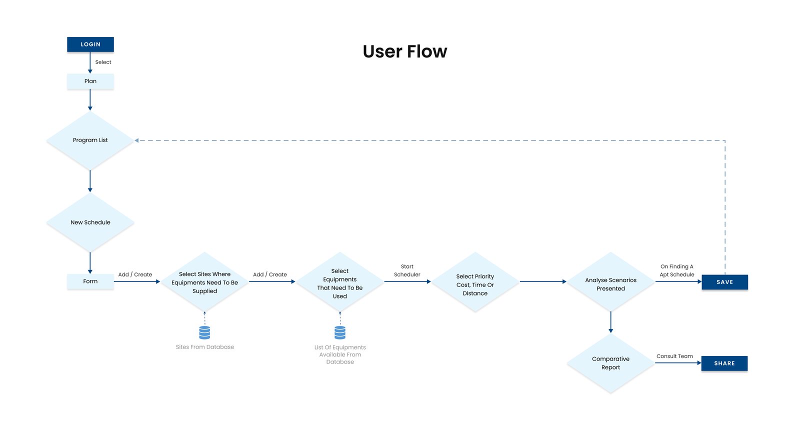
The scheduler is a sequence, not a page. A planner logs in, picks a program, names a schedule, chooses the sites that need equipment and the equipment that needs to move, and only then declares a priority. The scenarios come back from that declaration.
Two branches matter at the end: save the schedule that works, or generate a comparative report and take it to the team before committing.
User flow — from login to a saved schedule, with the report as a parallel exit
The scheduler
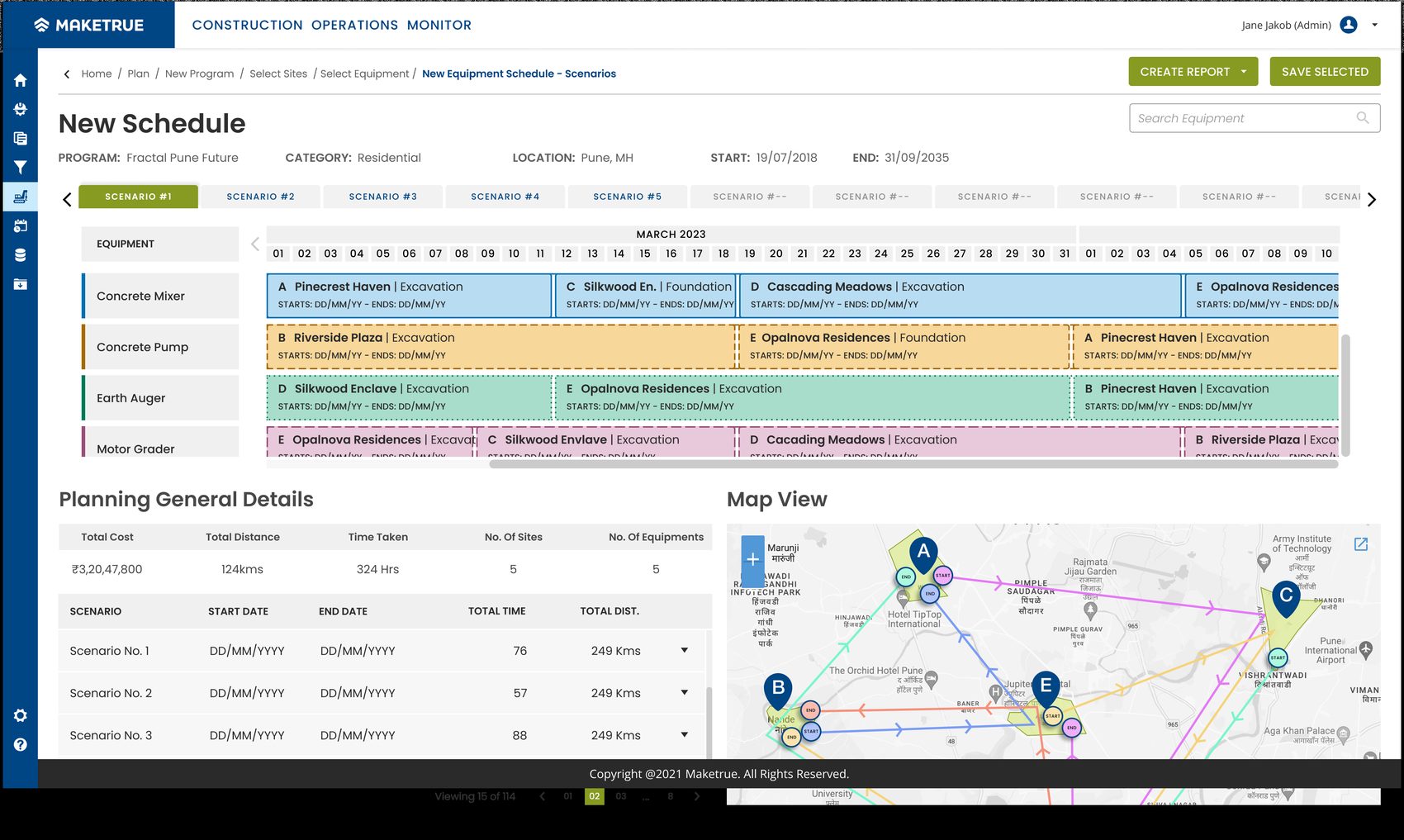
Each scenario is a full schedule, not a suggestion. Equipment runs down the left, time runs across, and every block is a machine committed to a site for a stretch of days. The map underneath shows the same plan geographically — which is where the distance cost becomes legible in a way a table never makes it.
Scenarios sit in tabs so they can be compared without losing the one you liked, and the planning summary below carries the totals that actually decide it: cost, distance, time, sites, machines.
New Schedule — scenario tabs, equipment timeline, route map and planning totals
Comparing the scenarios
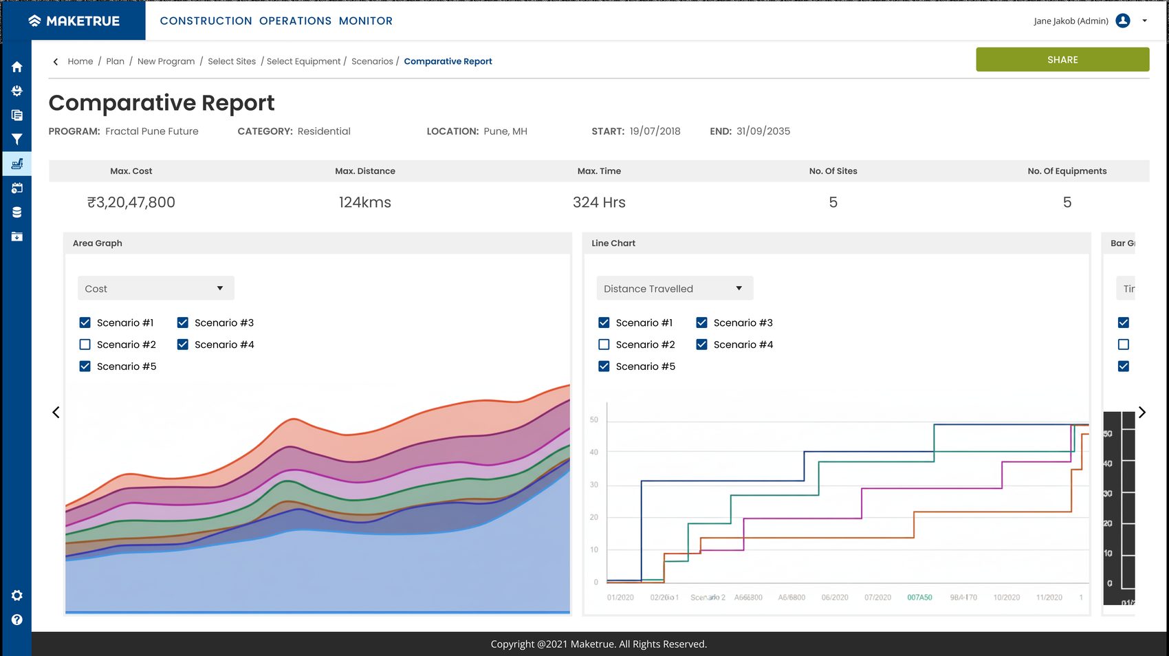
Picking between five schedules by reading five timelines is not a real task. The comparative report puts the scenarios on shared axes — cost, distance travelled, time — and lets you switch any one off to see the field more clearly.
It exists to be shared. The decision usually isn't one person's to make, and a report that can be sent is the difference between a scheduler that gets used and one that gets admired.
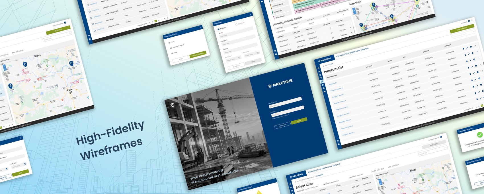
Comparative report — the same five scenarios, measured three waysWalk the prototype in Figma ↗High-fidelity wireframes across the full flow
Reflection
The interesting constraint here wasn't the scheduling logic — it was inheritance. Designing a feature into somebody else's product means your best idea is often the wrong one, because it would read as a seam. Most of the work was in the reading: figuring out the rules the existing interface was following without ever having written them down, then holding to them.
The design system was the part that outlived the feature. It started as a means of matching a house style and ended up as the artefact the team could build the next thing from.